
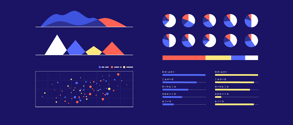
As a student, while reading for your exams, you may have been attracted to visual depictions of information. Flowcharts, graphs, pie charts, are still used for most statistics to give an overview of all the compendium of other boring data. Plus, in the age of the internet, infographics are getting viral like hotcakes. Data visualisation refers to this representation of the information through diagrams or pictures.
Well, now that we have the definition set aside, how can you make effective data visualisation? Of course, you would need some available tools that will help you to design them. A designer cannot work without their tools after all. Here are some of the tools that you will help you with your data visualisation process:
Imagine how difficult it would be to repeatedly format a design when you can just use a pre-set format. DataVisual, which was once private, became public and made the life of designers easier. Format your charts easily and coordinate large amounts of charts without facing any cluttering anxiety.
2. Tableau
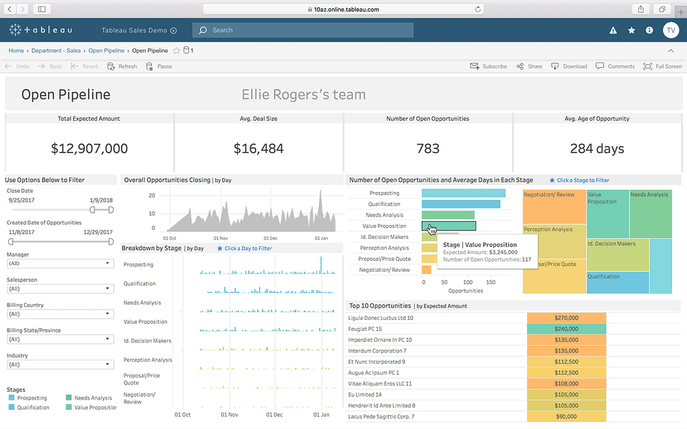
Referred to as one of the masters in Data Visualisation, Tableau is simple to use and can create interactive visualisations. One of the best things about Tableau is that you can use it for Big Data operations too which includes machine learning and artificial intelligence. On top of that, it is integrated with a number of database solutions like Amazon, SAP, Teradata, and AWS.
3. FusionCharts
This is a popular visualisation package which uses JavaScript charging. By creating over 90 different types of charts and giving you the edge to integrate over different platforms, FusionCharts rightfully earns its fame among designers. Plus, you don’t always have to build a visualisation chart from scratch. If you want, you can just choose from the live example templates and use your own data sources, where necessary.
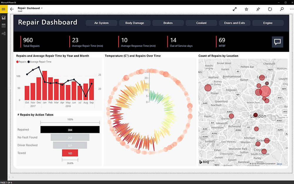
Microsoft Power BI is one of the most efficient data visualisation packages present in the market. Plus, with the Microsoft tag, it can be safely said to be one of the most trusted too. It has two versions: Power BI Mobile and Power BI Desktop. It comes with a lot of custom visualisations as well as helps you create visualisations using many natural languages. Also, you have Cortana as your personal assistant. Microsoft Power BI is quite flexible too and connects large data sources like Excel, Oracle, Azure, Zendesk, etc. Plus, you get to integrate with web services easily as well.
5. Plotly
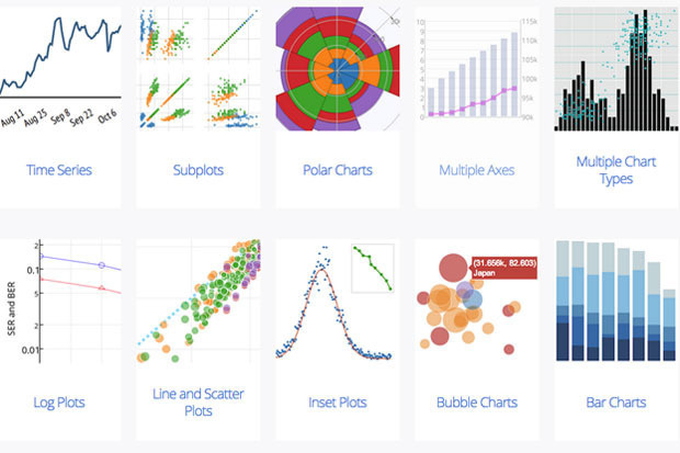
If you are eager to bring a bit of sophistication in your visualisations, then Plotly is the way for you to go. The reason for this is its integration with languages like Matlab, Python and R. It comes with a user-friendly interface and bases itself in the open-source d3.js visualisation library, especially for JavaScript.
So, engage your visualisation senses with these tools and start making sophisticated visual representations for your data. Present your project with a difference.
Oh, and talking about projects — you should check out our Data Science course. Designed to lift you up from ground zero, our course comprises of all the essential modules, including Data Visualisation. We’ll also help you develop a project along the way!
Liked reading this article? Learn more, here!


